Benedetta was launching her new consulting business, BGFP Advisory, and needed to build a complete visual identity from the ground up.
The goal of the project was to create a professional image that would communicate seriousness, stability, reliability, and trust, key values in the consulting sector.
The project included the design of the logo, brand identity, business cards, and website, with the aim of establishing a coherent and credible visual presence from the very beginning.
The strategy was to develop a visual identity that felt clean, simple, and solid, avoiding overly decorative or complex solutions that could weaken the perception of professionalism.
The design approach focused on visual elements capable of communicating order, balance, and stability.
The objective was to create a visual language that is minimal yet distinctive, reflecting the professionalism and reliability of the services offered.
The visual identity was developed through a balanced combination of colors, shapes, and imagery designed to reinforce a sense of security and solidity.
The logo and graphic elements follow a minimal and structured style, while the color palette and typography contribute to conveying a professional, stable, and contemporary image.T
he identity was then applied across the main brand touchpoints, including business cards and the website, creating a cohesive and recognizable visual system.
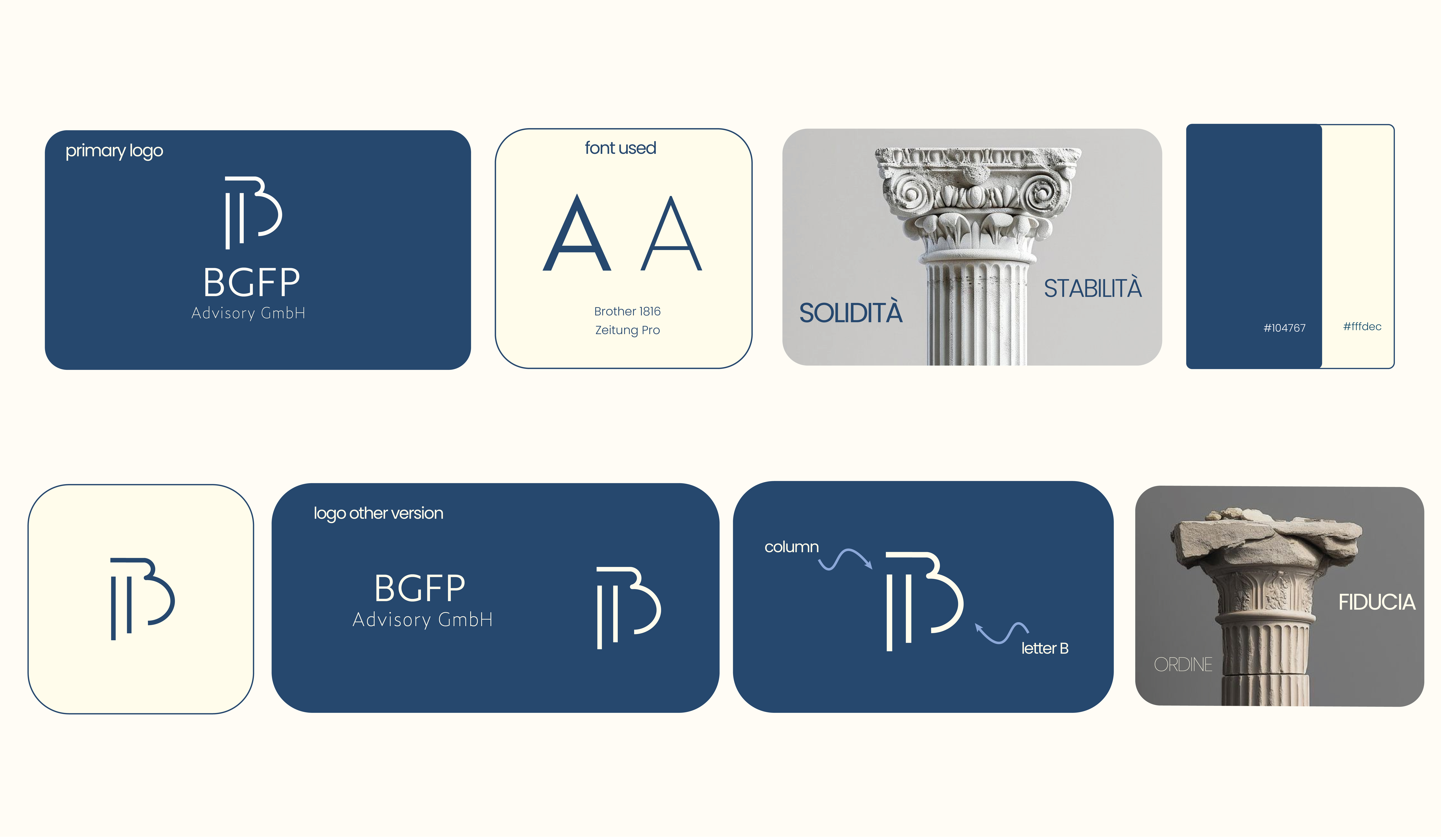
The client initially requested a color palette of purple and gray.
After analyzing the brand positioning and the values the company wanted to communicate, I proposed an alternative solution: blue paired with a cream tone.
Purple, in fact, is not generally perceived as a color that conveys stability and reliability, which are key values for a consulting firm.
Blue, on the other hand, is strongly associated with trust, security, and professionalism, making it a more coherent choice for the brand’s desired image.
The cream tone was introduced to balance the palette, adding elegance and warmth without compromising the visual clarity and professionalism of the identity.
For the logo, I developed a concept combining the letter “B” with the shape of a column. The column is a powerful visual symbol, representing solidity, stability, and structure, reflecting both the consulting world and the reliability the brand aims to convey.
Through the combination of shapes and colors, the visual identity communicates a sense of order, trust, and professionalism, perfectly aligned with the core values of BGFP Advisory.
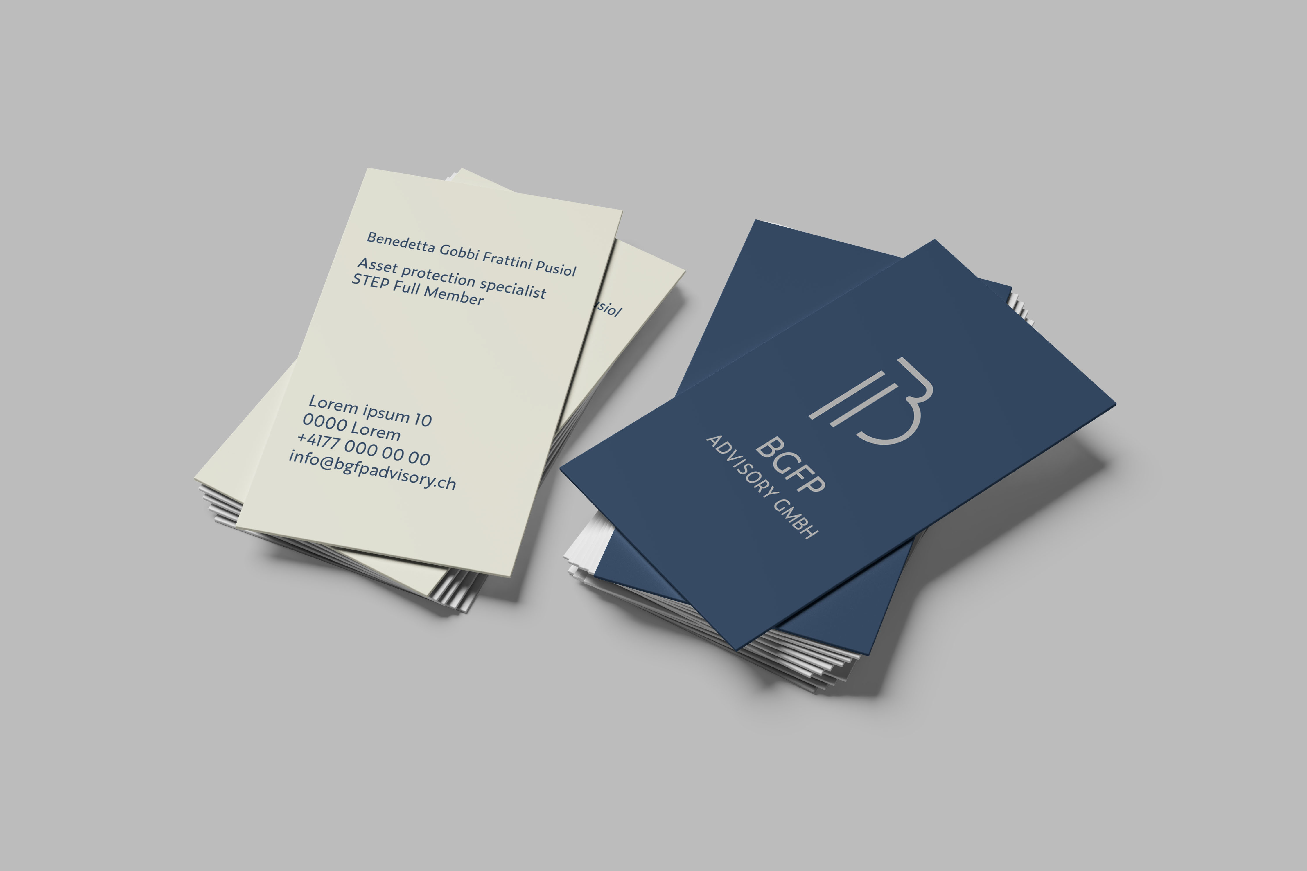
I have always placed great importance on business cards, as I believe they are an essential tool, especially for professionals who rely on networking to build relationships. A business card is not only a way to share contact information, but also an opportunity to communicate identity, care, and professionalism.
For BGFP Advisory, I designed a business card that is simple, clean, and well-balanced. The choice of a vertical layout was intentional, as it visually echoes the column element used in the brand identity.
I also pay close attention to material choices: the card was printed on thick matte soft-touch paper, with rounded corners and a spot UV finish on the logo. These details help convey a sense of quality, elegance, and attention to detail.
The colors used are cream white and blue (they may appear slightly different in the mockups).
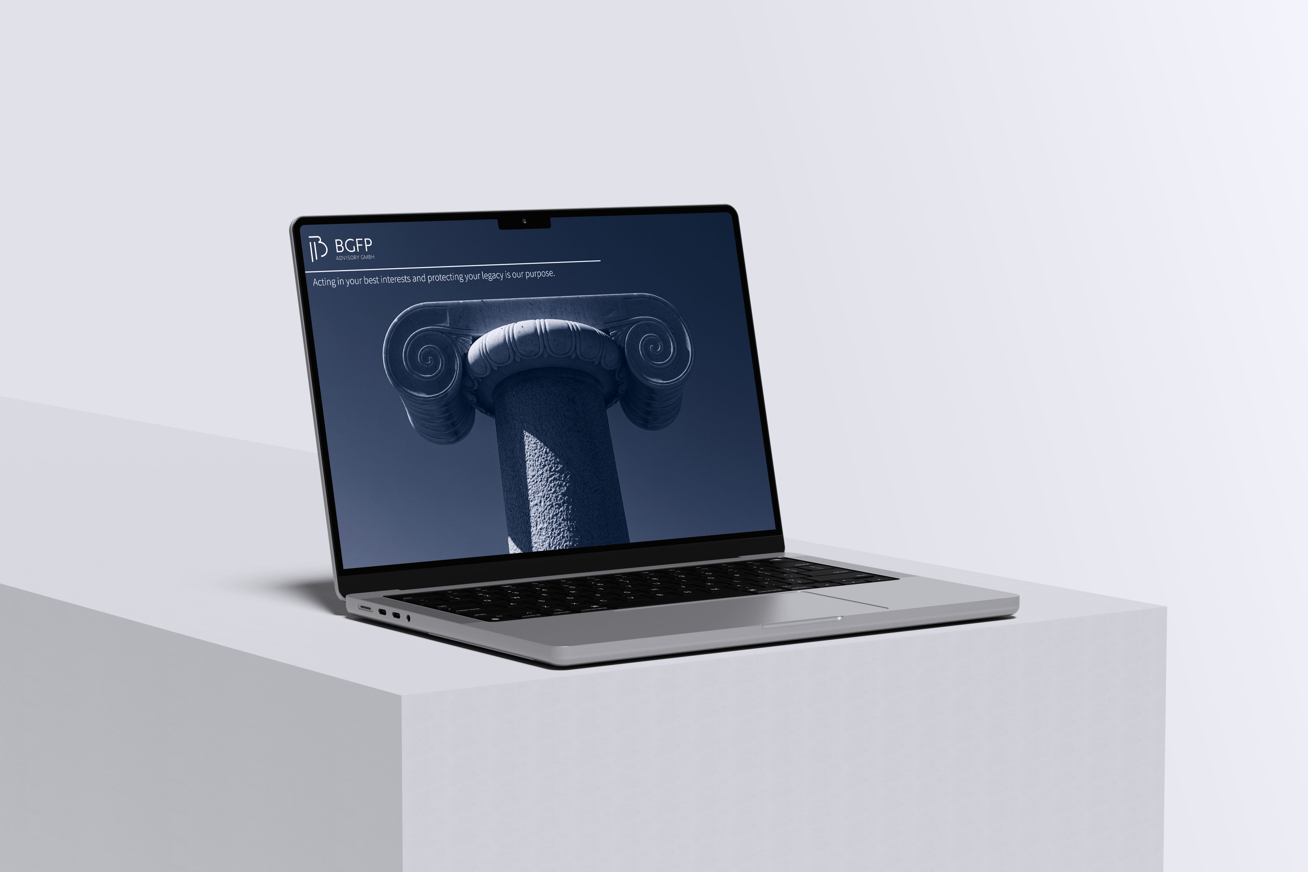
The website is a one-page design because the available content did not require multiple pages.
I opted for a simple and clean structure, with a professional and minimalist style.
In the hero section, I included an image of a column to visually convey stability, solidity, and security—key values of the brand.
The layout emphasizes readability and clarity, with well-defined spacing between sections, highlighting the main services without overwhelming the user.
The images and color scheme (blue and cream) reinforce the sense of reliability and professionalism established by the brand identity.
 Visita il sito di BGFP Advisory